Index
Motivation
In general, restaurant prices are usually positively related to the local average household income. Our question is: Could we also observe similar phenomenon when it comes to hospital charges and local poverty rates? Namely, does a hospital arrange its charges according to its location? We utilize the Inpatient Prospective Payment System (IPPS) Provider Summary and poverty rate statistical data to build a model to explore the relationship between hospital charges and local poverty rates.
Data we explored
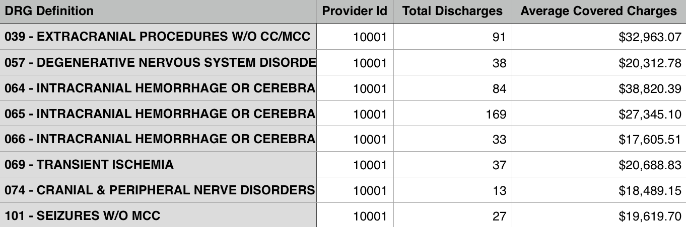
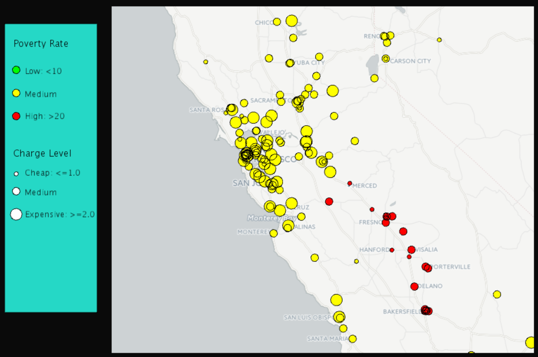
See Appendix for the sources of the hospital data and the poverty rate data. Note that both are data from year 2011. We have the original data about hospitals, including DRG(Diagnosis-Related Group), hospital addresses, zip codes and charges. There are 163,065 records in the file, including 3,337 hospitals and the top 100 DRGs. An example of records in the data is shown in Figure 1. We processed the hospital data in two different ways.
- For each hospital, we combine charges for all DRGs to generate a reasonable number representing its charge level. To do this, we first find the average charge for each DRG over the whole US. Then we divide the charge of the hospital by the average charge so that we have a charge level for each DRG and each hospital. This charge level can tell us how expensive the service provided by each hospital is for each DRG. Second we calculate the average level among all the DRGs one hospital provides service for. This average level is what we use to represent a hospital’s charge level.
- We pick the hospital charges for 5 DRGs for analysis. First we find the top 5 most common DRGs (194, 690, 292, 392, 641) out of 100 DRGs. Second, since not all hospitals provide service for these 5 DRGs, for a fair comparison in our analysis we only include hospitals that provide service for all 5 DRGs. There are 2,664 such hospitals out of total 3,337 hospitals.
Another important set of data is the poverty rate data by county. To combine the hospital data and the poverty data, we find the latitude and longitude for each hospital with the help of a website (see 3) in Appendix A), by which we find the county for the hospital by using R packages. Then we combine the two sets of data by matching counties. Moreover, we add a new attribute the weighted poverty rate. We will explain what it is and how to generate it in the next section.
Key ideas
- In the data collection stage, we found the local poverty rates corresponding to the hospital locations. However, this is not reasonable if a hospital is close to the boundary of its county and in fact closer to the centers of some other counties. For this reason, we update the original poverty rate corresponding to hospitals by using weighted poverty rates.
To generate the weighted poverty rate for a hospital, we take into consideration all the counties that are within 50 miles of the hospital. The weight of the poverty rates of the neighboring counties is based on the distance between each county center and the hospital. More precisely, the closer the county center is to the hospital, the higher weight its poverty rate has in the weighted poverty rate. - To get better linear regression models, we separate hospitals into five groups based on their locations: west, midwest, northeast, southwest and southeast. We design the following algorithm:
- Step 1:
- Initialize 5 linear models corresponding to 5 region groups.
- Step 2:
- For each state, find the closest model among the models generated in Step 1. Then put each state into the group that corresponds to its closest model. A model is the closest if the sum of L2 distance of all hospital points in that state to the model is minimized.
- Step 3:
- Apply the least squares method to each group and then update the coefficients in the linear equations.
- Step 4:
- Repeat Step 2 and 3 until the clustering groups stay the same.
By this algorithm, we find 5 best ’fit’ least squares models.
Analysis
We used the hospital data in two ways:
- We applied the least squares method to hospital charges versus poverty rates. The result is shown in Figure 2. After the poverty rate is updated, the linear regression result is improved. In Figure 3, we get a better linear regression. The mean squared error dropped from 34.06 to 21.47.
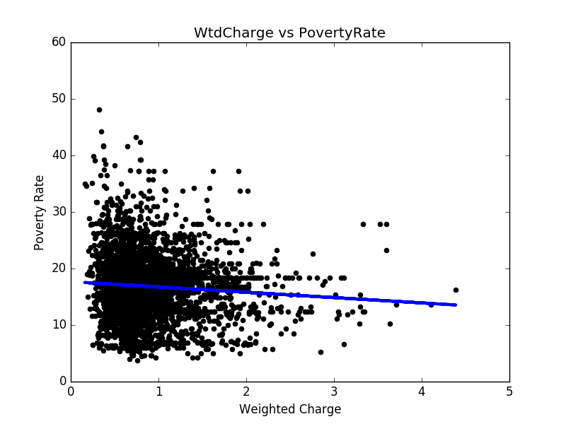
Figure 2: Hospital charges v.s. The original poverty rates 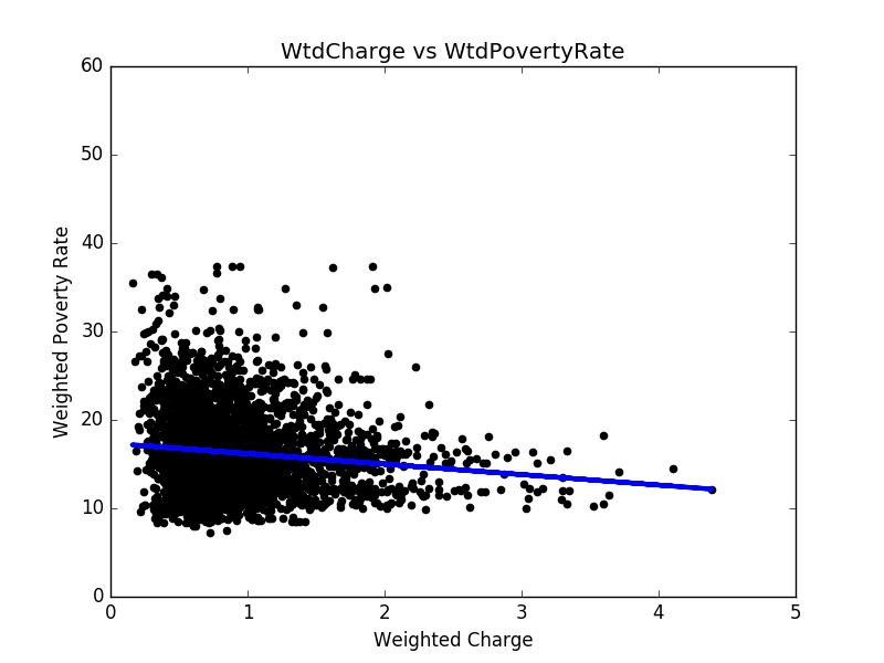
Figure 3: Hospital charges v.s. The weighted poverty rates
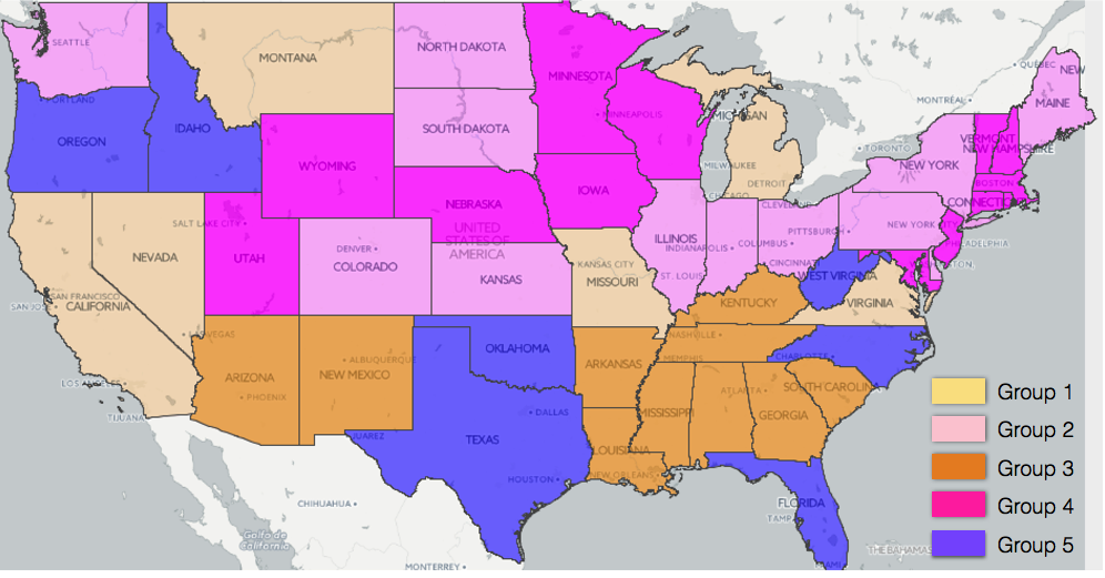
To further improve the linear regression results, we divide the states into five groups, according to Figure 4. By the least squares method, we apply linear regression to each region (see Figure 5 to Figure 9 for results). In most regions, there exists negative correlation between hospital charges and weighted poverty rates. However, in the prosperous western region, the poverty rates are mostly lower than 20%, and there are many expensive hospitals whose charge levels are higher than 3. As a result, it is hard to find the relation between weighted poverty rates and hospital charge levels, as shown in Figure 10 .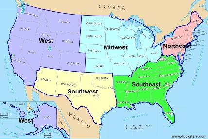
Figure 4: Group distribution 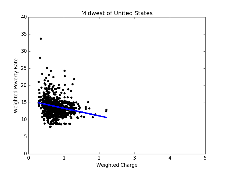
Figure 5: Linear regression result in the midwest 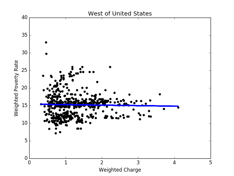
Figure 6: Linear regression result in the west 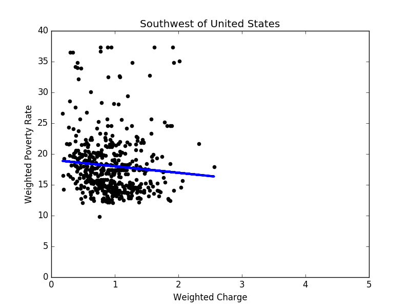
Figure 7: Linear regression result in the southwest 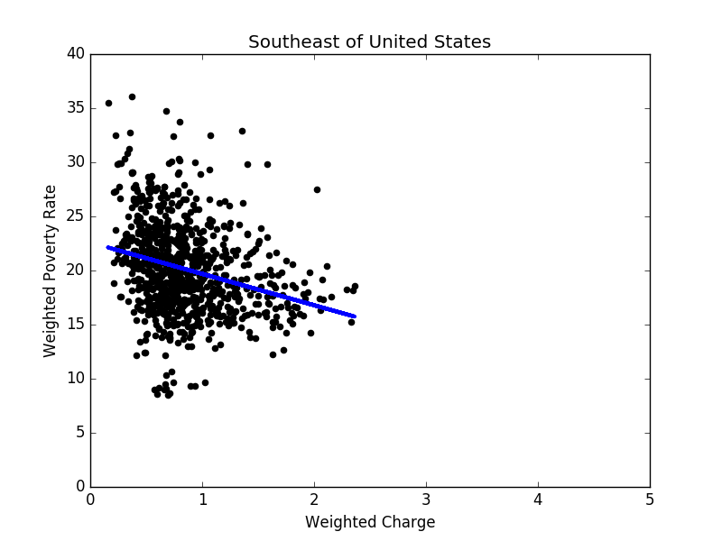
Figure 8: Linear regression result in the southeast 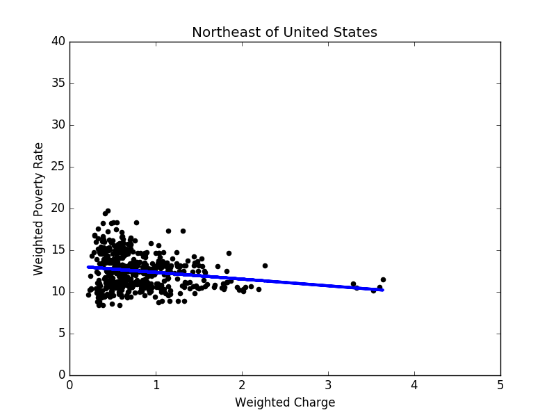
Figure 9: Linear regression result in the northeast Once we have linear regression models for 5 groups based on locations only, one question we can ask ourselves is: is this the best way to group states? To answer this question, as described in Section 3, we apply the 5-means clustering to obtain 5 ”best fit” linear models. The clustering results are shown in Figure 11. The total error drops from 203.4 to 181.3 after the 5-means clustering.
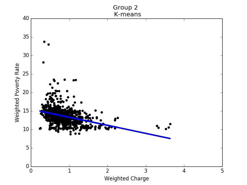
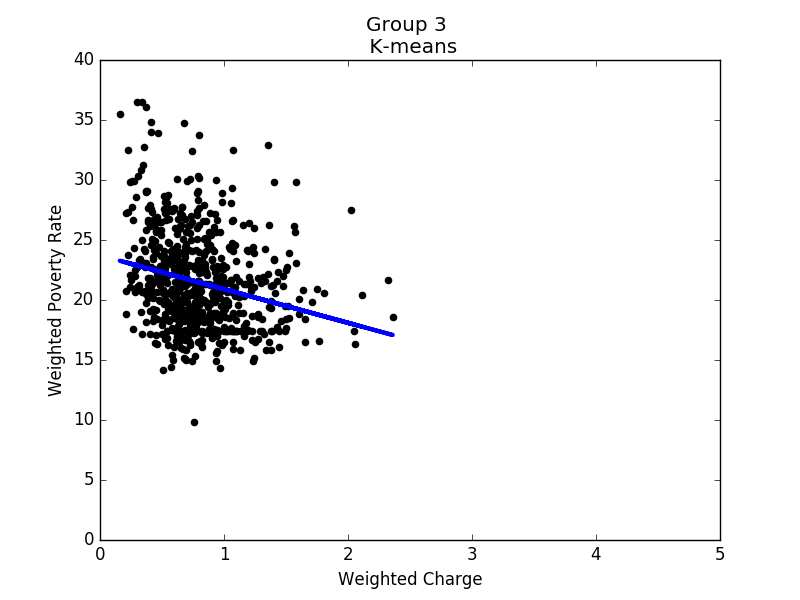
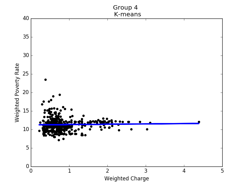
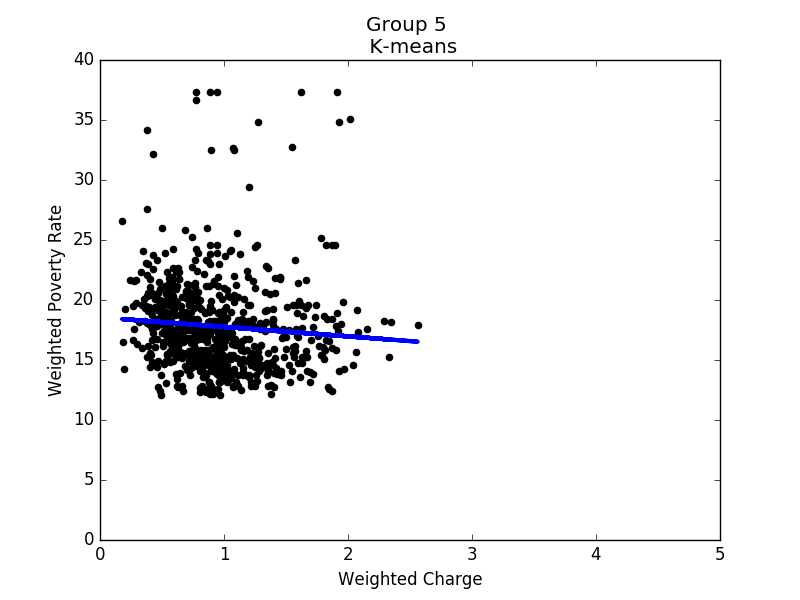
Figure 12 to 16 show the linear regression model for each group. Based on these results, it seems that states in each group share some common properties. For example, states in group 3 generally have higher poverty rates, and the correlation between hospital charges and poverty rates is the strongest of all groups. In contrast, the poverty rates in group 4 are mostly between 8% and 14%, while the correlation is close to none. To conclude, in prosperous areas, the correlation is not obvious; in other areas, we do observe negative correlations.
-
We picked the 5 most common DRGs (194, 292, 392, 641 and 690) and hospitals that provide service in all these DRGs. To investigate the correlation of hospital charges and poverty levels, we applied the least squares method, obtaining the best fit line with an error of 289.76. For a comparison, when we used the weighted poverty rates, the error decreased to 225.77. We also tried the ridge regression method, but the results were similar to those of the least squares.
We note that the line from the least squares is
l1 : 0.2415x_1-0.1403x_2+0.0536x_3- 0.2108x_4-0.0504x_5=16.8473
when we use the weighted poverty rates. However, it is easy to find out that the hospital charges for each DRG are negatively correlated to the weighted poverty rates. We combine the 5 least squares results that correspond to each DRG, and obtain the line
l2 : −0.00262x_1-0.00726x_2-0.0076x_3-0.01136x_4-0.00844x_5= 16.83664.The corresponding error is 232.78. So l1 and l2 fit the data with similar errors. There are two possible reasons for that. One is that neither l1 nor l2 fits the data very well. The other is that hospital charges within the 5 DRGs are correlated. In fact, it is easy to check that they are all positively correlated.
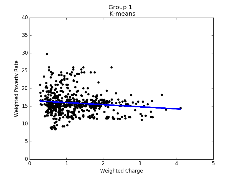
Linear regression of group 1 |
Linear regression of group 2 |
Linear regression of group 3 |
Linear regression of group 4 |
Linear regression of group 5 |
Conclusion
There is negative correlation between hospital charges and local poverty rates, which makes hospital costs in poor areas lower than in rich areas. The weighted poverty rate increases the correlation. However, the data is more spread out than we thought, and the correlation is not as strong as we expected. It is possible that there are other important factors affecting hospital charges that are not considered in our study. It could be a policy issue.
Actually, in the beginning, our goal was to find whether there was a correlation between average family income and hospital charges. However, we could not find data on average household income in each county. We guess it is harmful to make these data public since it may cause discrimination and is possible to affect the safety of prosperous areas. The previous class about ethics also made us reconsider how to present our results. We had planned to point out hospitals near areas with high poverty rates whose charges are high. However, after that class, we decided not to do this.
Besides, we learned that it is not easy to define whether one data point is noise or not. Originally, we had planned to remove outliers after linear regression. However, the advice we got was that we should not remove any data point even though it is far away from the model unless we have strong reasons to do so. This is confusing at first but in the end we understand the importance of every data point. That is to say, if data points are far away from the model, we can not simply say that they are noise or remove them. What we have to do is to analyze whether it indicates other characteristics.
We also find a paper, Inpatient Hospital Charge Variability of U.S. Hospitals, whose conclusion is similiar to us. In this paper, it presents that hospitals price- setting strategies associate with uninsured status, which has positive correlation to poverty rate.
Appendix
- A provider level summary of Inpatient Prospective Payment System (IPPS) discharges, average charges and average Medicare payments for the Top 100 Diagnosis-Related Groups (DRG). link
- Data on poverty levels: link
- Finding longitude and latitude for address: link
- Finding counties for addresses that cannot be found by R packages: link
- Inpatient Hospital Charge Variability of U.S. Hospitals: link